About the app
An app for the departed loved ones.
Immortal App is an app that allows you to gather, share and cherish the memories of your loved ones who have passed away. From Relatives to friends to pets all of us have had a personal experience with losing a near and dear one to nature’s ultimatum – death. But we can keep them alive in our memories forever through the immortal app.
Challenge
An app to cater to the needs from Gen X to Gen Z.
There were many challenges which we faced and tackled during the project, as the app idea is very unique and doesn’t hold any competition in the market as of now. Some of the challenges are listed herewith:
- One of the major challenges was to cover the entire target audience which ranged from 20-years-old, who wanted the app to be engaging and fun, to 80-year-olds, who aren’t very tech-savvy.
- The app has a profile of the departed people who are no more, so the profile holder was not the actual user of the profile, so it was a task to authenticate and make it functional for a third person to operate their profiles.
- It was also difficult to connect the people with each other and make a family tree out of it.
Immortal App Brand Book v1.0
— BRANDING —
The Immortal logo icon is mainly inspired by the almond-like shape of the ‘amygdala’, it is a part of the brain that is responsible for the processing of memory and emotions. Also, the shape represents memories that are asymmetrical and natural, like human memories.
The design principle followed throughout the project was to keep the logo very minimal and simple, keeping in mind the target audience which is mostly going to be above 30-35+ y.o. The colors have been kept black and white with the inclusion of contrast color to define the brand identity of the Immortal App.
Typography
Primary Typeface
Montserrat
abcdefghijklmnopqrstuvwxyz
1234567890
abcdefghijklmnopqrstuv
Color Palette
Brand Colors
Immortal App’s Colors mainly include two shades of Blue: Dark Blue and Light Blue, Also a gradient of both the colors. These colors have become a recognizable identifier for the App.
— APP DESIGN —
ONBOARDING
Shouldn’t there be a set of screens that brief users in an app?
79% of the users abandon the app within five to seven days of using it. Hence, it becomes pivotal to impress and brief the first time app users in a very small window that lasts not more than 20 seconds.
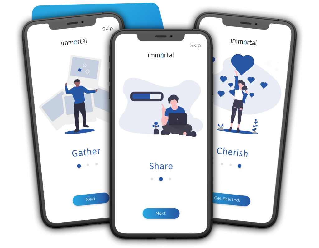
In the Immortal App there are three onboarding screens which greet and welcome the users and also brief them about the basic working of the app : Gather, Share and Cherish the memories of their departed loved ones.

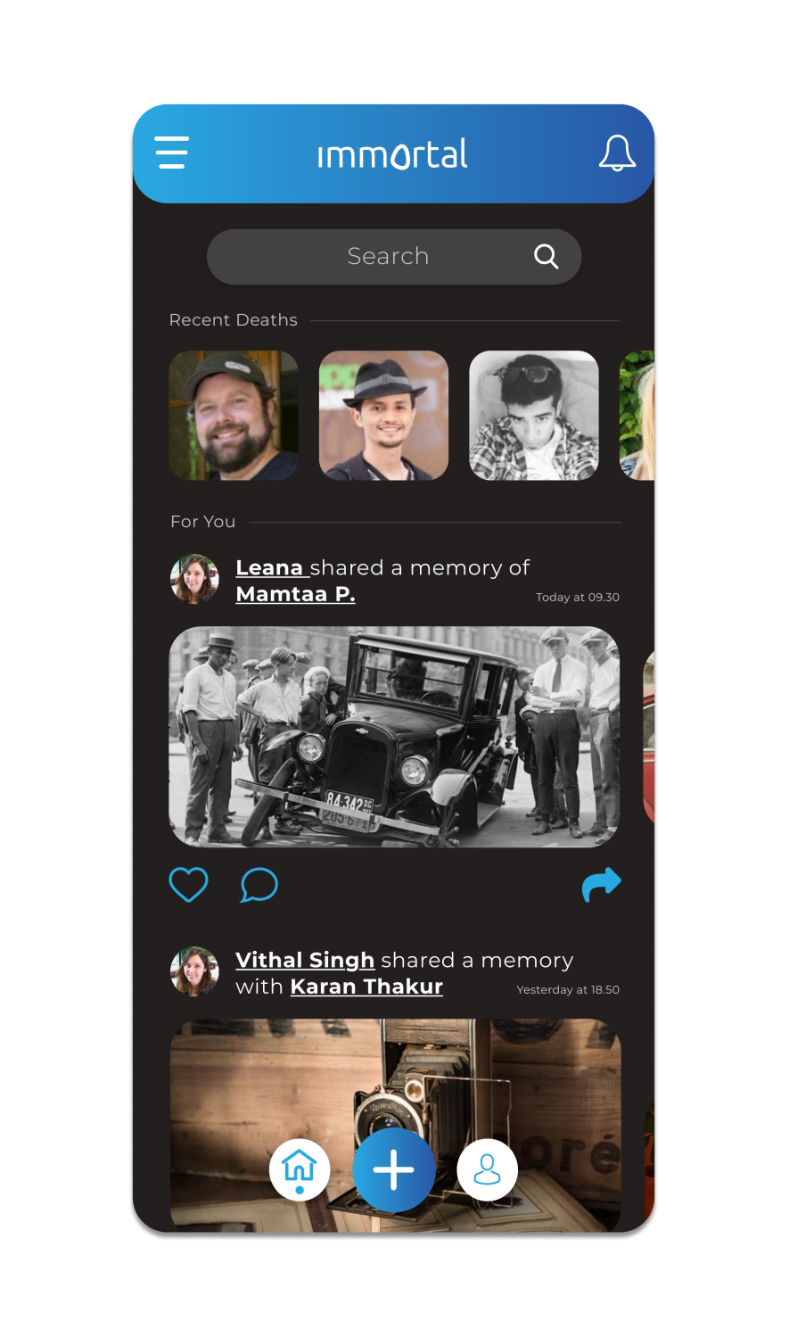
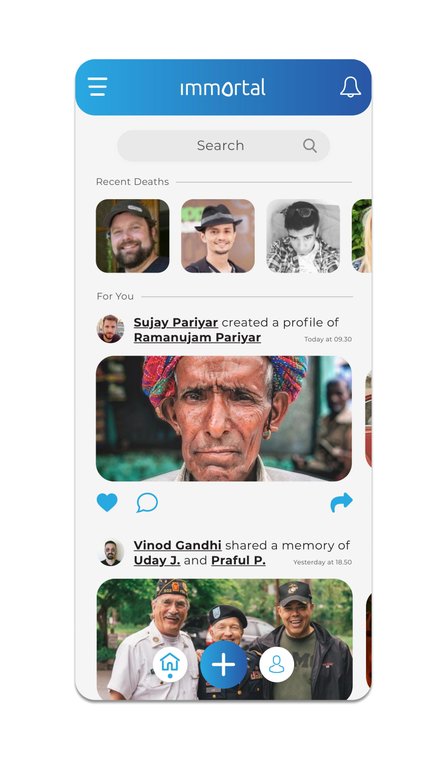
DUAL THEME CONCEPT
The app is designed for a broader target audience.
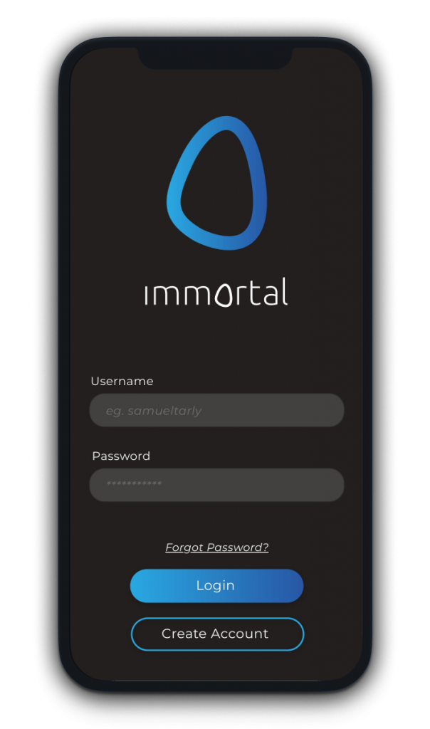
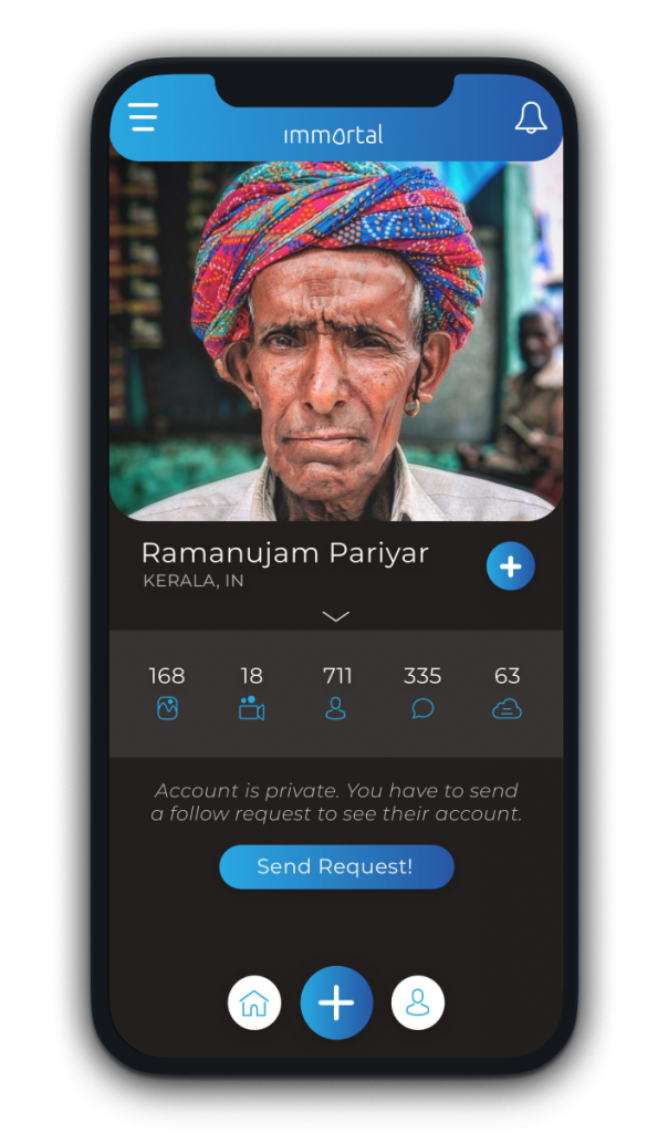
The Light theme is preferred by the Older Audience whereas the Dark theme is preferred and enjoyed by the Younger audience, hence app Immortal app automatically switches the theme based on your demographics.
Immortal App Userflow
RESULTS
The average engagement time per user increased by more than 2-3 times.
The number of new onboardings and engagement time of the existing users from both the segments of the target audience, exponentially increased.
Let’s collaborate
Send us an email, to discuss a new project.
We’re a team of creatives who are excited about unique ideas and help companies and startups build top-notch products.
